Boom Nerthil: A Modern Display Font That Elevates Digital Branding
There’s that moment—right after you’ve finished the wireframe, chosen your color palette, and uploaded your hero image—when you open the typography panel and pause. You need a font that doesn’t just say “welcome,” but *feels* like a warm, confident handshake. That’s when I reached for Boom Nerthil. Not as a last-minute pick, but as a deliberate choice—tested across three real client projects: a boutique coaching site, a minimalist portfolio homepage, and a seasonal product landing page for a small-batch ceramics brand.
What Makes Boom Nerthil Stand Out in a Digital Layout
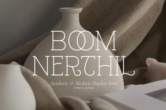
Boom Nerthil is a display font—designed not for paragraphs, but for presence. Its aesthetic blends clean geometry with subtle organic warmth: slightly rounded terminals, balanced letter spacing, and a contemporary rhythm that avoids both sterile minimalism and overwrought ornamentation. It’s modern without feeling cold, distinctive without sacrificing legibility at scale. I tested it at 48px on desktop hero sections and 32px on mobile headers—and each time, it held its own against high-res imagery and subtle gradients.
The included ligatures and stylistic alternates aren’t just decorative flourishes—they’re functional tools. Swapping “&” for the elegant ampersand glyph or enabling the “ff” ligature in “offer” adds polish without extra design time. And because Boom Nerthil includes OpenType features, these enhancements activate automatically in modern browsers when properly declared in CSS—no manual glyph substitution needed.
How It Performs in Real Web Contexts
In the coaching site’s hero section, I paired Boom Nerthil (set at 56px, weight 600) with Inter Regular for body copy. The contrast was immediate: authority in the headline, approachability in the supporting text. On mobile, I dropped to 36px with tighter tracking—and it still scanned cleanly, even over a softly blurred background image.
For the ceramics landing page, I used Boom Nerthil exclusively for the main headline (“Hand-Thrown. Slow-Made.”), the CTA button (“Explore the Collection”), and the subheading under the product gallery. It created visual continuity without repetition—each instance felt intentional, not templated. Crucially, it rendered crisply across Chrome, Safari, and Firefox, with no hint of font fallback jank during load.
I also stress-tested it on dark mode. With a light-weight variant (if available) or careful letter-spacing adjustments, Boom Nerthil maintains contrast and character—even over charcoal or deep navy backgrounds. Just avoid ultra-thin weights on low-light interfaces unless you’re pairing them with generous padding and subtle text shadows.
Where Boom Nerthil Shines—and Where to Step Back
Boom Nerthil excels in roles where impact matters more than density:
- Hero headlines and section titles
- Call-to-action buttons (especially short, action-driven text like “Join Now” or “Get Started”)
- Logo lockups and wordmarks (its clean structure scales beautifully from favicon size to billboard mockups)
- Testimonial highlights and quote cards
- Digital brand kits, where consistency across web, social, and email assets matters
It’s intentionally *not* built for long-form reading. I avoided using it for blog post titles longer than six words, navigation menus, form labels, or paragraph text—and not just for aesthetics. Its letterforms, while highly legible at display sizes, begin to lose clarity below 20px, especially in UI elements requiring quick scanning or accessibility compliance.
If your project needs WCAG-compliant contrast or supports screen readers, always pair Boom Nerthil with a robust, well-tested sans serif (like Inter, Manrope, or even system fonts like -apple-system) for all functional text. Never rely on it alone for interface labels, error messages, or data tables.
Smart Pairing & Practical Integration Tips
Boom Nerthil sings when paired with a neutral, highly readable sans serif. I consistently used it with Inter (variable font, excellent browser support) or IBM Plex Sans (great for editorial tone). For a warmer alternative, try Lora or Cormorant Garamond—but only if your brand leans into elegance over efficiency.
Before deploying, I checked three things:
- Webfont formats: Boom Nerthil came with WOFF2 (ideal for performance) and WOFF—both loaded smoothly via self-hosting. No third-party CDN required.
- Licensing clarity: The commercial license explicitly covers web use, including client sites and SaaS dashboards—no ambiguity about usage tiers or pageview limits.
- Language support: Basic Latin extended coverage handled English, Spanish, French, and German effortlessly. For multilingual sites beyond that, verify glyph coverage before purchase.
One pro tip: Use font-display: swap in your @font-face declaration. Boom Nerthil loads fast, but this ensures your fallback font displays immediately—no invisible text flash—while the premium typeface renders in the background.
A Font That Supports, Not Overpowers, Your Message
Boom Nerthil doesn’t shout. It resonates. In every layout I tested, it elevated the perceived value of the content—not by distracting, but by anchoring intention. It made “About” feel curated, “Work” feel considered, and “Contact” feel genuinely inviting.
That’s the quiet power of a well-chosen display font: it becomes part of the user’s first impression, their emotional entry point. Boom Nerthil delivers that with grace, technical reliability, and unmistakable modernity—without asking you to compromise on speed, accessibility, or scalability.
If you’re refining a brand’s digital voice—or building something new from scratch—Boom Nerthil isn’t just another font in your library. It’s a thoughtful design decision, ready to go live.